 The fabulous Mike Dargie of RebelRebel Podcast interviewed me about comics, life, high school, improv, fonts and more! Check it out on his website or on iTunes or SoundCloud!

Latest Comics
INTERVIEW on REBELREBEL PODCAST GOES VIRAL!
 The fabulous Mike Dargie of RebelRebel Podcast interviewed me about comics, life, high school, improv, fonts and more! Check it out on his website or on iTunes or SoundCloud!
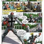
 CANADIAN HEROES
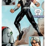
Two Gargoyles Comics “McLean’s Cover” promo starring THUNDER! With huge thanks to The Art of Joe Davis for the art and MikeRieger.ca for making the concept come to life with his journalistic wizardry! TWOGARGS PATREON: http://patreon.com/twogargs/


Twogargs now in HALIFAX, Nova Scotia!
Two Gargoyles Comics are now at Strange Adventures in HALIFAX!!! G’wan down and say hi! https://twitter.com/strangeadventrz/status/1049735857371004929


Twogargs now in Fredericton, New Brunswick!
You can now find every Two Gargoyles title at the fantastic Strange Adventures in Fredericton, New Brunswick (and very soon in Halifax, Nova Scotia as well)! Visit your local comic shop and check out local creators– we all need each other to help comics thrive!


KELOWNA COMIC EXPO
Come see Michael McAdam and Kyle Burles at Kelowna Comic Con this weekend!! Bring your inhaler and smoke mask! We ain’t lettin’ no pesky forest fires stop us! #makecomics #indiecomics #smoky #kelowna #canadian #artist #writer






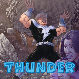


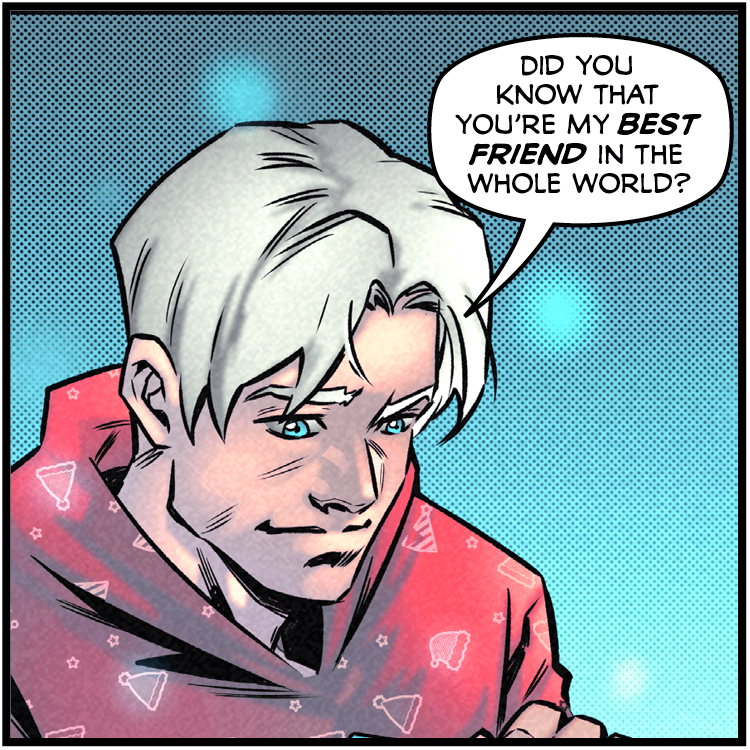
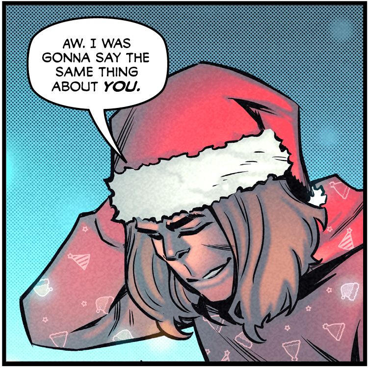
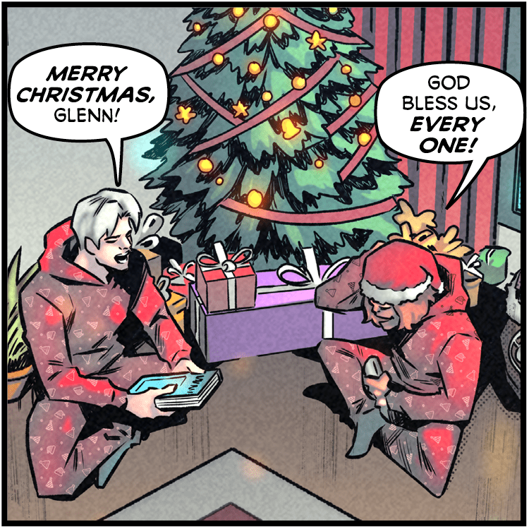
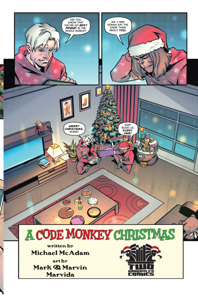
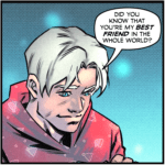
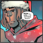
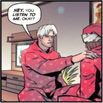
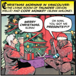
 Code Monkey Christmas
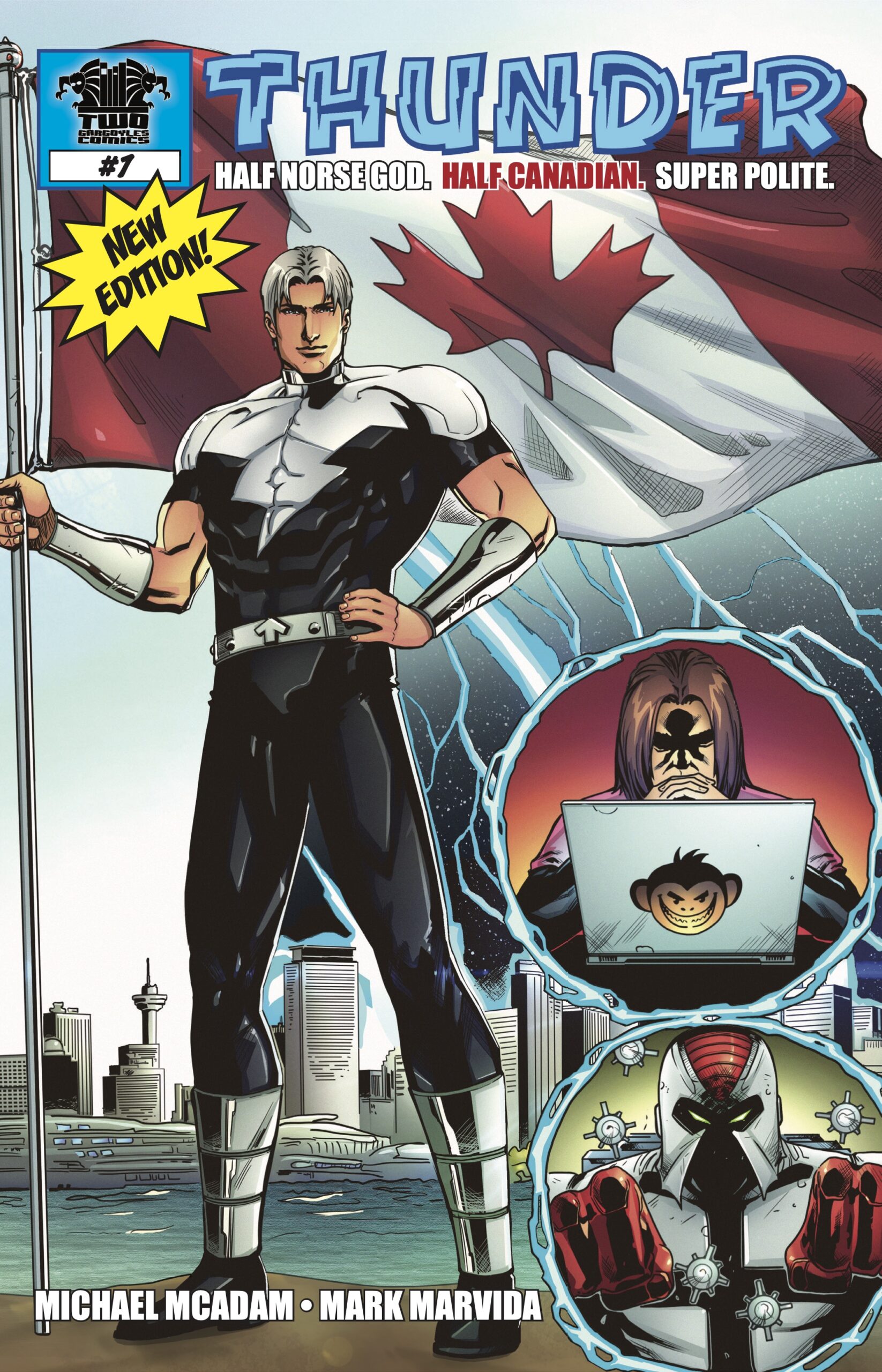
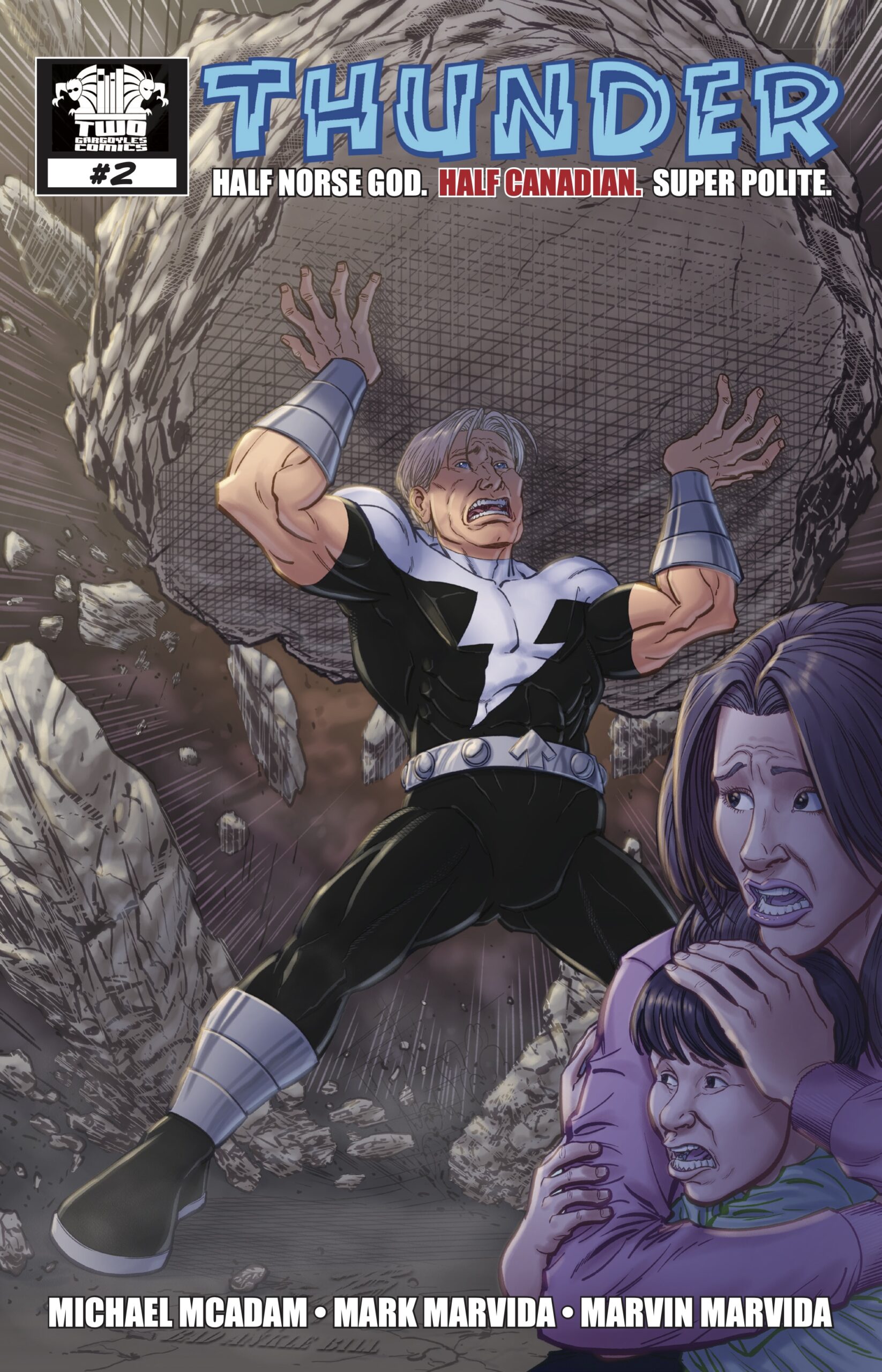
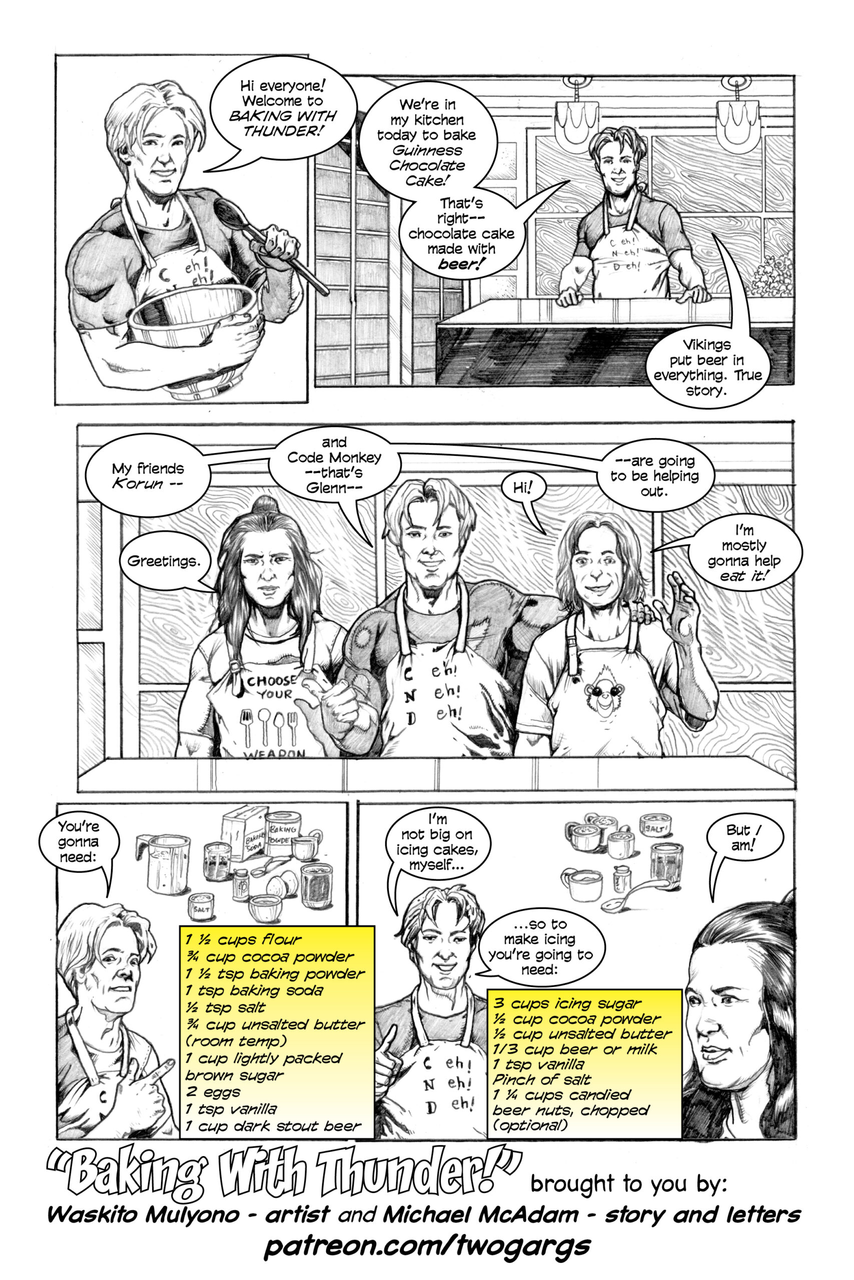
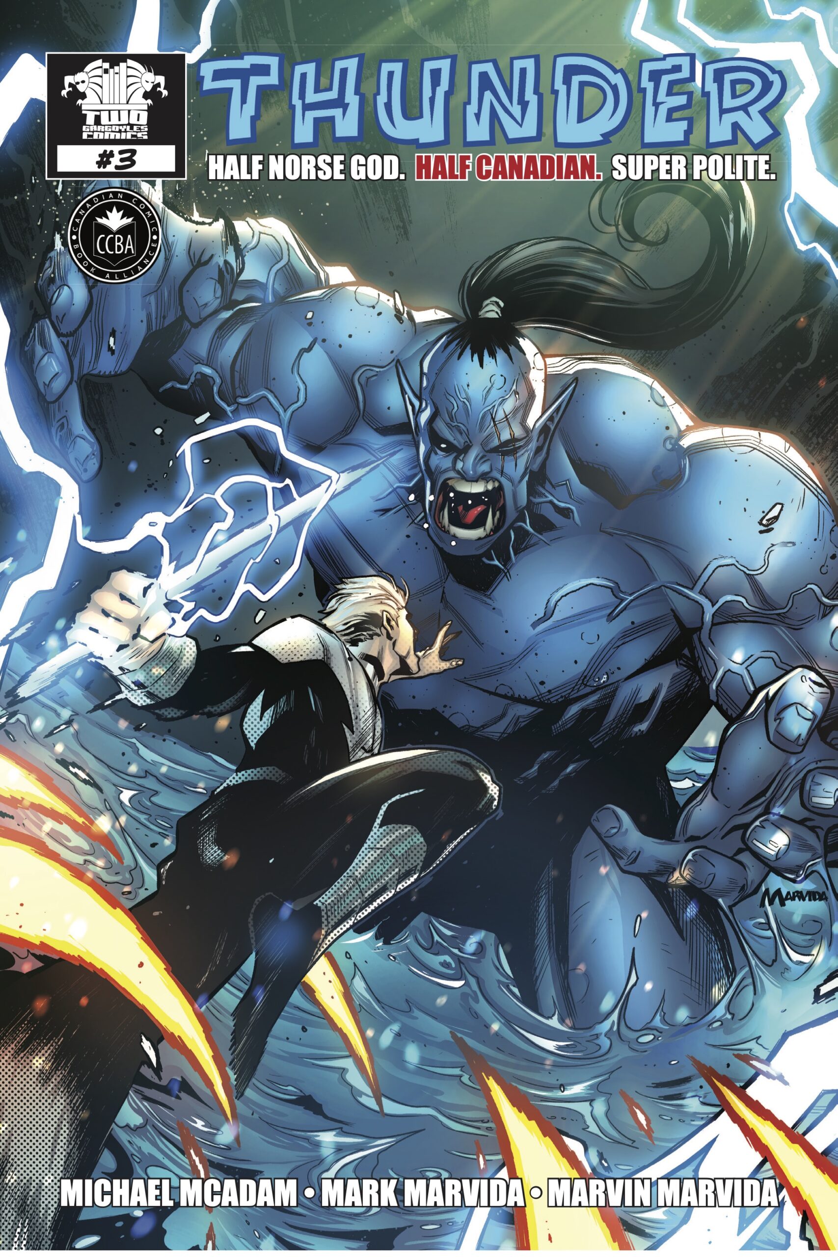
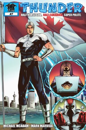
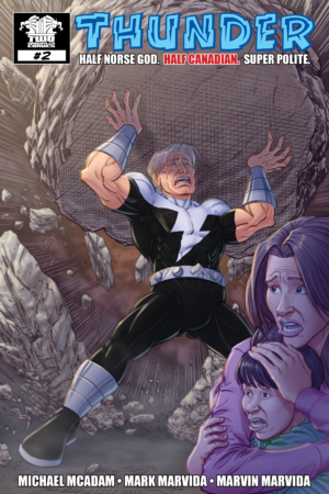
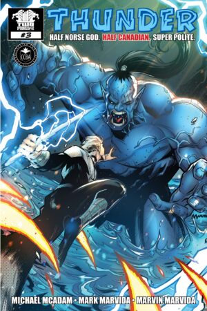
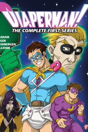
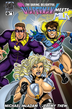
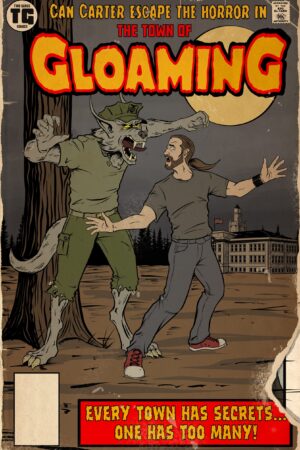
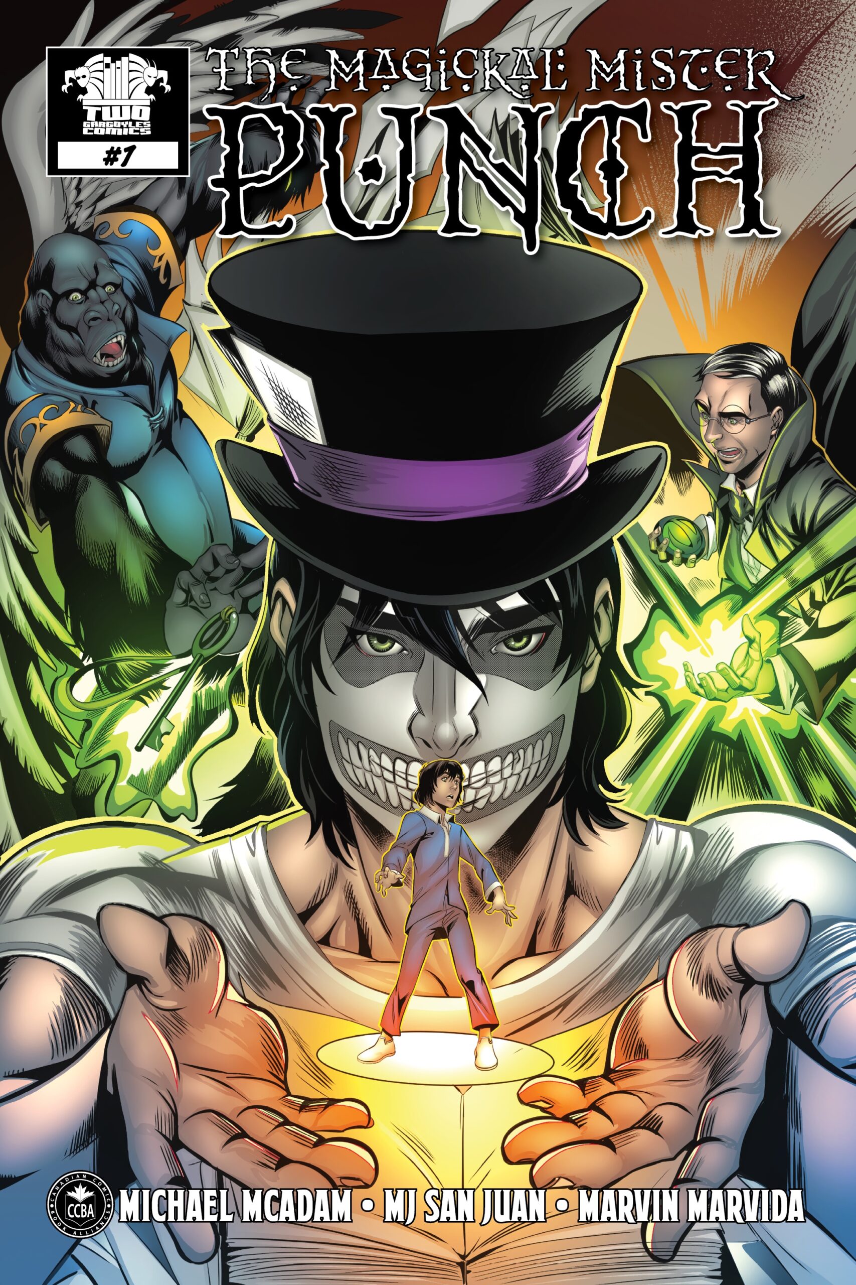
 “Twogargs” is an independent publisher of comic titles, including the genres of superheroes, comedy, horror, and urban fantasy… with more to come.
You can read all about each title and individual issue on this site using the main menu above. You can purchase digital copies of these comics right here on the site, and print copies at Indyplanet, or at DriveThruComics.
Two Gargoyles Comics is based in Alberta, Canada, and appears live at conventions in Western Canada and wherever else the winds take us!

